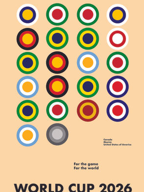
World Cup 2026 Minimalist Poster
Inspired by the Bauhaus art movement, this design for the 2026 World Cup combines geometric abstraction, sans-serif typography, and linear grid set up to create clean lines for a simple, yet striking design.
Application: Illustrator
Institution: Pratt Institute, Typography (Summer 2024)

The composition emphasizes balance and using basic shapes, such as the circles to resemble soccer balls. The colors in the circles represent each flag of the winning national team for the men’s World Cup since it began in 1930, with the last monochromatic circle waiting to be colored in with the 2026 winning country.
The bold, sleek, sans-serif typography - Futura - and the use of negative space reflects the functional, modernist principles of the Bauhaus movement. Following the movement of the flags, the text descends with the World Cup slogan (for the game, for the world), the host countries (Canada, Mexico, and the United States of America), followed by the event itself.

Brazil
1958, 1962, 1970, 1994 & 2002
World Cup Champions
Green: 009739
Yellow: FEDD00
White: FFFFFF
Spain
2010
World Cup Champions
Red: AA151B
Yellow: F1BF00
Undecided
2026
World Cup Champions
Outer Gray: 5C5A5C
Middle Gray: 939393
Inner Gray: D2D0CF


